Calendar Configuration
Display events in a beautiful, interactive calendar using the [lre_calendar] shortcode.
Overview
The calendar integration uses FullCalendar to provide:
- Five calendar views — month grid, list (week), list (month), time grid (week), and multi-month (year)
- Responsive view switching (different views per breakpoint)
- Optional view switcher dropdown in the navigation pill
- Click-to-view event details
- Smooth navigation between periods
- Mobile-responsive design
- Multi-day event support
- Custom theming
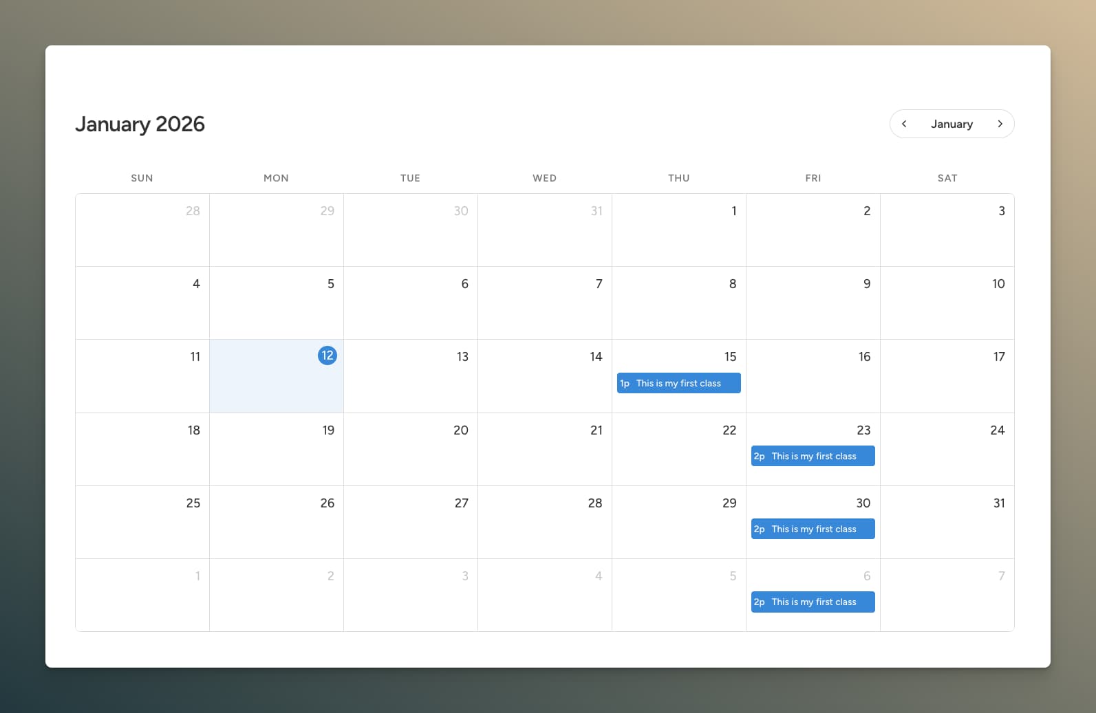
Basic Usage
Add the calendar to any page or post:
[lre_calendar]
That's it! The calendar displays all events with "Display in calendar" enabled.
Shortcode Attributes
Customize the calendar with attributes:
[lre_calendar theme="dark" height="600px" event_display="link"]
Available Attributes
| Attribute | Description | Default | Options |
|---|---|---|---|
theme | Color theme | default | default, minimal, dark |
primary_color | Override primary color | — | Any hex color |
event_bg | Event background color | — | Any hex color |
event_text | Event text color | — | Any hex color |
event_display | Click behavior | offcanvas | offcanvas, link, popup, none |
popup_id | Bricks popup template ID (when event_display="popup") | — | Template ID |
height | Calendar height | auto | auto, 600px, 80vh, etc. |
post_type | Filter by post type | all | event, workshop, etc. |
taxonomy | Filter by taxonomy | — | event_category, etc. |
terms | Terms to filter by (requires taxonomy) | — | Comma-separated slugs or IDs |
taxonomies | Multiple taxonomy filter | — | Pipe-separated groups |
id | Custom calendar ID for targeting | — | Any string |
view | Initial desktop view | dayGridMonth | See Calendar Views |
tablet_view | View on tablet breakpoint | — | Any view, or empty to match desktop |
mobile_view | View on mobile breakpoint | — | Any view, or empty to match desktop |
view_switcher | Comma-separated views to expose in the dropdown switcher | — | e.g. dayGridMonth,listWeek,multiMonthYear |
class | CSS class | — | Any class name |
Calendar Views
Five views are available, each with its own strengths:
| View ID | Label | Best For |
|---|---|---|
dayGridMonth | Month Grid | Default overview, family calendars, weekend events |
listWeek | List (Week) | Day-grouped agenda for the current week |
listMonth | List (Month) | Day-grouped agenda spanning a full month |
timeGridWeek | Time Grid (Week) | Schedules with overlapping or hourly-slotted events |
multiMonthYear | Multi-Month (Year) | Year-at-a-glance with twelve mini month grids and dot indicators |
[lre_calendar view="listWeek"]
[lre_calendar view="timeGridWeek"]
[lre_calendar view="multiMonthYear"]
Time Grid (Week)
The Time Grid view shows a weekly time axis with hourly slots and positioned event blocks, including a "now" indicator line that tracks the current time.
List Views
List (Week) and List (Month) views group events by day in a clean agenda format — ideal for reading rather than scanning. The Bricks editor renders server-side previews with real event data so you can design list views without switching to the frontend.
Multi-Month (Year)
A compact year-at-a-glance overview rendering twelve mini month grids in a responsive grid. Days that contain events show a dot indicator.
Responsive View Switching
Set different calendar views for tablet and mobile breakpoints. Leave a value empty to inherit the desktop view.
[lre_calendar view="dayGridMonth" tablet_view="listWeek" mobile_view="listMonth"]
You can also set defaults globally under Recurring Events → Settings → Calendar → Default View / Tablet View / Mobile View.
View Switcher
Add an icon-triggered dropdown menu inside the navigation pill that lets visitors switch between calendar views.
[lre_calendar view_switcher="dayGridMonth,listWeek,multiMonthYear"]
The switcher accepts any comma-separated list of view IDs (see the Calendar Views table). When omitted, no switcher is rendered. In the Bricks calendar element, this is exposed as a multi-select control.
URL Parameters
The calendar reads several URL parameters so you can deep-link to a specific date, view, or event.
| Parameter | Purpose | Example |
|---|---|---|
lre_date | Navigate to a specific month or day | ?lre_date=2026-06-01 |
lre_start | Alias for lre_date | ?lre_start=2026-06 |
lre_view | Set the initial calendar view | ?lre_view=listWeek |
lre_event | Auto-open the offcanvas/popup for a specific event on load | ?lre_event=123&lre_date=2026-06-01 |
{taxonomy} | Filter events by any registered event taxonomy term | ?event_type=workshop |
URL parameters override shortcode attributes for view and date, making it easy to send people to "the next workshop in June" from outside the site.
https://example.com/events/?lre_view=listMonth&lre_date=2026-06&event_category=yoga
Theme Presets
Default Theme
Clean, professional blue styling.
[lre_calendar theme="default"]
Minimal Theme
Subtle borders, clean aesthetic.
[lre_calendar theme="minimal"]
Dark Theme
Dark background for low-light environments.
[lre_calendar theme="dark"]
Custom Colors
Override theme colors per-calendar:
[lre_calendar primary_color="#e74c3c" event_bg="#ff6b6b" event_text="#ffffff"]
Event Click Behavior
Offcanvas (Default)
Slides in a panel from the side with event details.
[lre_calendar event_display="offcanvas"]
The offcanvas panel shows:
- Event title
- Date and time
- Featured image (optional)
- Excerpt (optional)
- "View Event" button
- Add to Calendar button (if enabled)
Direct Link
Navigates directly to the event page.
[lre_calendar event_display="link"]
Bricks Popup
Opens a Bricks Builder popup template with the clicked event's post as context, so dynamic data tags in the popup resolve against that specific event.
[lre_calendar event_display="popup" popup_id="1234"]
Create a Bricks popup template for your event detail layout, then reference its template ID. The plugin automatically injects the popup template into Bricks' active templates.
Disabled
Events display but aren't clickable.
[lre_calendar event_display="none"]
Calendar Height
Control calendar dimensions:
[lre_calendar height="600px"]
[lre_calendar height="80vh"]
[lre_calendar height="auto"]
auto— Expands to fit content- Fixed pixel value — Specific height
- Viewport height — Percentage of screen
Filtering by Post Type
Show events from specific post types:
[lre_calendar post_type="workshop"]
[lre_calendar post_type="event,workshop,class"]
Multiple Calendars
Add multiple calendars with different configurations:
[lre_calendar post_type="workshop" theme="minimal"]

[lre_calendar post_type="meeting" theme="dark"]
Each calendar operates independently.
Global Settings
Configure defaults in Recurring Events → Settings → Calendar:
View Settings
- Default View — Starting view on desktop (any of the five available views)
- Tablet View — View used on tablet breakpoints (leave empty to inherit desktop)
- Mobile View — View used on mobile breakpoints (leave empty to inherit desktop)
- Week Starts On — Sunday or Monday
- Default Height — Auto or fixed
Theme & Styling
- Theme Preset — Default theme for all calendars
- Custom Navigation Icons — Upload custom arrow images
Event Display
- Click Behavior — Default offcanvas/link/none
- Show Featured Image — In offcanvas panel
- Show Excerpt — In offcanvas panel
- Show Time — In offcanvas panel
- Button Text — "View Event" button label
- Open in New Tab — Link behavior
Offcanvas Settings
- Position — Left or Right
- Width — Panel width (e.g., 400px)
- Background Color — Panel background
- Text Color — Auto-calculated for contrast
Default Display
- Default Display for [Post Type] — Auto-enable calendar display for new posts
Per-Event Colors
Set custom colors on individual events. Colors can be configured in Settings → Calendar.
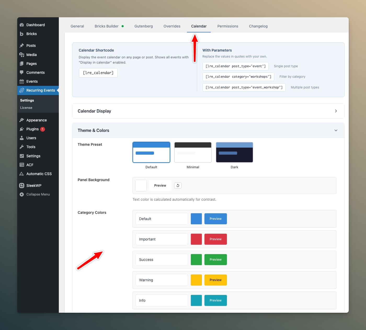
You can change the color headings from here as well.
Calendar UX Features
Today Button
The calendar header includes a "Today" button for quick return to the current month. On the mini calendar (Event Occurrences element), a dot button appears between the navigation arrows when viewing a different month.
Navigation Loading Overlay
A spinner overlay covers the calendar grid during view transitions and stays visible until all events are fully rendered, eliminating the visual flicker that previously happened when switching months or views.
Single-Event Day Shortcut (Mobile)
On mobile devices, tapping a day with exactly one event goes directly to the event page instead of showing a list with a single item.
Location in List View
When "Display location" is enabled, the venue name or virtual event label appears beneath the event title in all list views.
Virtual Event Labels
Virtual events display a friendly label such as "Join us online via Zoom" (or whichever platform is configured) in the calendar grid, list view, and offcanvas panel, instead of the raw calendar label.
Taxonomy Filtering
Filter which events appear on a calendar by taxonomy:
[lre_calendar taxonomy="event_category" terms="yoga,pilates"]
Filter by multiple taxonomies using pipe-separated groups:
[lre_calendar taxonomies="event_category:yoga|event_tag:beginner"]
Use the id attribute to assign a custom identifier when placing multiple calendars on the same page:
[lre_calendar id="yoga-cal" taxonomy="event_category" terms="yoga"]
[lre_calendar id="fitness-cal" taxonomy="event_category" terms="fitness"]
You can also filter by taxonomy via URL — append the taxonomy slug as a query parameter (see URL Parameters).