Event Elements
Specialized Bricks elements for displaying event information.
Calendar Element
Display an interactive calendar as a native Bricks element with full visual controls and editor preview.
Adding the Element
- In the Bricks elements panel, search for LRE Calendar (under the LRE Elements category)
- Drag it onto your page
- Configure using the visual panel controls
Panel Controls
All [lre_calendar] shortcode options are available as visual controls, organised into six groups:
| Group | Controls |
|---|---|
| Data Source | Post type, taxonomy filter, terms, compound multi-taxonomy filter |
| Calendar View | Default view, Tablet view, Mobile view, View switcher, height, week start day |
| Appearance | Theme preset, primary color, event colors |
| Behaviour | Event click action (offcanvas, link, popup, none), open in new tab |
| Header Filter | Native filter taxonomy, display mode (pills, buttons, dropdown) |
| Advanced | Custom CSS class, calendar ID |
Calendar Views
The Default View, Tablet View, and Mobile View dropdowns each expose all five available views:
| View | Use For |
|---|---|
Month Grid (dayGridMonth) | Default monthly overview |
| List (Week) | Day-grouped agenda for the current week |
| List (Month) | Day-grouped agenda spanning a full month |
| Time Grid (Week) | Weekly time axis with hourly slots and a now indicator |
| Multi-Month (Year) | Year-at-a-glance with 12 mini month grids |
Set Tablet View or Mobile View to "Same as desktop" to inherit the Default View at that breakpoint, or pick a different view to switch automatically on smaller screens.
View Switcher
The View Switcher control is a multi-select of view IDs. Pick any combination — say, Month Grid, List (Week), and Multi-Month (Year) — and an icon-triggered dropdown appears inside the navigation pill on the frontend, letting visitors switch views without leaving the page.
Bricks Popup Support
Set the event click action to Bricks Popup to open a Bricks popup template when an event is clicked. The popup receives the clicked event's post as context, so dynamic data tags in the popup resolve against that specific event.
- Create a Bricks popup template for your event detail layout
- In the Calendar element settings, set event display to Bricks Popup
- Select your popup template from the dropdown
The plugin automatically injects the popup template into Bricks' active templates.
Popup support also works with the [lre_calendar] shortcode: [lre_calendar event_display="popup" popup_id="1234"]
Editor Preview
The Bricks editor renders a complete server-side calendar preview with real event data — including List (Week) and List (Month) views, which render server-side previews with real event data. You can configure and style the calendar without switching to the frontend.
AJAX Lifecycle Support
Calendars inside Bricks popups, AJAX-paginated containers, or dynamically loaded query results initialise correctly — no extra configuration needed.
Event Occurrences Element
Display upcoming dates for a single event—perfect for event detail pages.
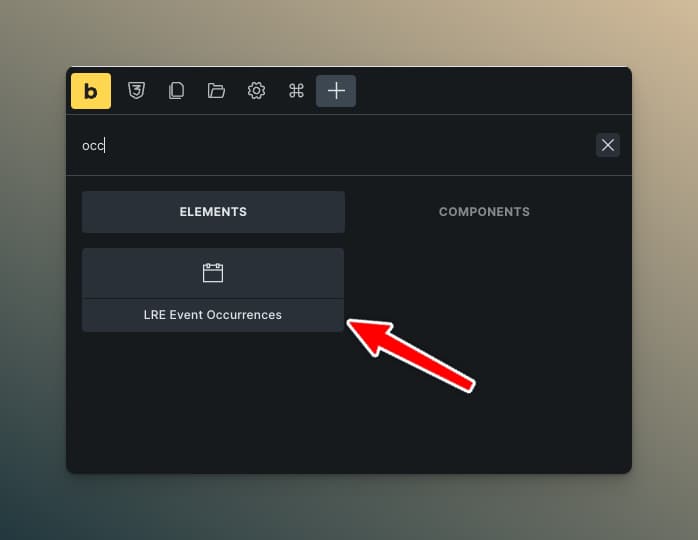
Adding the Element
- On your single event template, add the LRE Event Occurrences element
- Configure display mode and styling
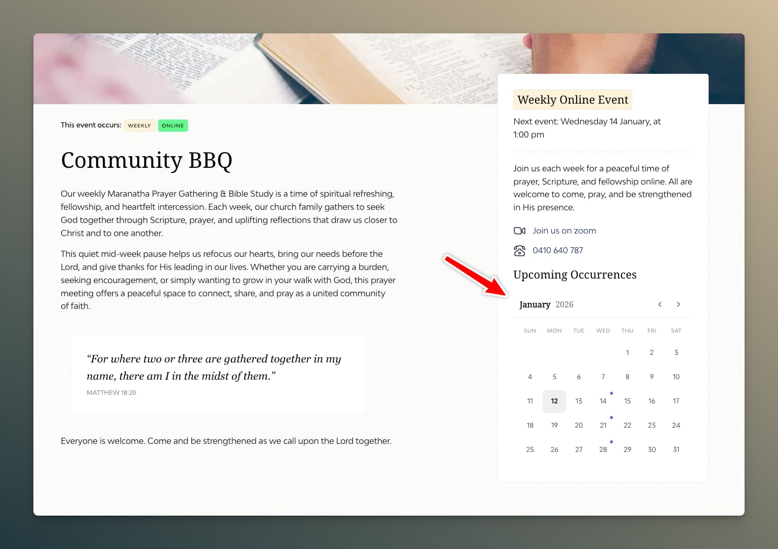
Display Modes
List Mode
Shows occurrences as a formatted list.
List Settings:
| Setting | Description |
|---|---|
| Layout | Vertical or Horizontal |
| Show Weekday | Display day name |
| Show Time | Display event time per occurrence (uses per-weekday and per-occurrence time overrides where set) |
| Max Items | Limit number shown |
| Link Dates | Make dates clickable |
| Separator Style | Line between items (solid, dashed, dotted, double) |
| Separator Color | Line color |
Styling Controls:
- Container: width, padding, background, border, border radius
- Item: padding, gap between items
- Typography: separate controls for date, weekday, and time
Mini Calendar Mode
Shows a compact monthly calendar highlighting occurrence dates.
Calendar Settings:
| Setting | Description |
|---|---|
| Dot Color | Color of occurrence indicators |
| Show Navigation | Prev/Next month arrows |
| Custom Arrow Icons | Use your uploaded calendar arrows |
Styling Controls:
- Width and padding
- Day cell backgrounds (normal, today, occurrence)
- Typography for headers and dates
- Border and border radius
Common Settings
| Setting | Description |
|---|---|
| Number of Occurrences | How many dates to show (max 375, or 0 for all) |
| Exclude Current | Hide the currently viewed occurrence; remaining occurrences shown are those after the one being viewed |
| Empty Message | Text when no upcoming dates |
| Date Format | PHP date format string |
Use Cases
- Event detail page: Show "Other Dates" for recurring events
- Sidebar widget: Quick view of upcoming sessions
- Registration page: Let users see all available dates
Countdown Element
Display a contextual countdown or relative time label for upcoming events.
Adding the Element
- Search for LRE Countdown in the elements panel
- Add it inside a query loop or on a single event template
Display Modes
Smart Label
Natural-language output based on proximity: "Today at 2:00 pm", "Tomorrow at 9:00 am", "Starting in 45 minutes", or "Happening now".
Countdown Units
Structured countdown with individual time units that tick live:
3 days 12 hours 45 minutes 30 seconds
Compact Badge
Minimal badge-style display for event cards:
3d 12h 45m
Content Settings
| Setting | Description |
|---|---|
| Display Mode | Smart Label, Countdown Units, or Compact Badge |
| Show Days | Toggle days unit |
| Show Hours | Toggle hours unit |
| Show Minutes | Toggle minutes unit |
| Show Seconds | Toggle seconds unit |
Styling
Full control over typography, colors, spacing, and per-unit styling. Status-aware color controls let you style the "Happening now" state differently from an active countdown.
Styling controls are available in both Countdown Units and Compact Badge modes.
See Countdown & Relative Time for full details.
Pagination Element
Add pagination to your Recurring Events query loops.
Setup
- Ensure your query loop has "Posts Per Page" set
- Add the LRE Pagination element below your query loop
- Select your query loop as the target
Settings
| Setting | Description |
|---|---|
| Target Query | Which query loop to paginate |
| Show Page Numbers | Display numbered page links |
| Show Prev/Next | Navigation arrows |
| Previous Text | Text for previous button |
| Next Text | Text for next button |
| Max Page Links | How many page numbers to show |
Styling
Full control over:
- Button/number appearance
- Active page styling
- Hover states
- Spacing and alignment
- Disabled state
Behavior
- Updates via AJAX (no page reload)
- Works with active filters
- Updates URL for shareable links
- Scrolls to top of query loop on page change
Element Best Practices
Performance
- Limit occurrences — Don't request more than needed
- Use pagination — Don't show hundreds of events at once
- Lazy load images — Enable browser lazy loading
Accessibility
- Meaningful labels — Use descriptive text for navigation
- Keyboard navigation — Test that filters work with keyboard
- Screen reader text — Add context for assistive technology
Mobile
- Stack filters — Use column layout on mobile
- Touch-friendly — Ensure adequate tap targets
- Test date picker — Flatpickr works on mobile, but verify
Responsive Design
Use Bricks' responsive controls to adjust:
- Number of columns in query loops
- Filter layout (row → column on mobile)
- Typography sizes
- Spacing
For the calendar element specifically, prefer the built-in Tablet View and Mobile View controls (under Calendar View) over manual responsive overrides — they automatically swap the calendar's render mode at each breakpoint.